Save Time: Get 5 Simple Writing Tips
you can put to use in 10 minutes
Graphics and Copywriting: A Simple Tutorial
Award-winning writer Kathy Widenhouse has helped hundreds of nonprofits and writers produce successful content , with 750K+ views for her writing tutorials. She is the author of 9 books. See more of Kathy’s content here.
Updated 7.18.24
I’m a content writer, not a designer. Yet I know my projects need both graphics and copywriting to be effective in today’s visual content landscape. Writing and design go hand-in-hand, much like peanut butter and jelly, to deliver a complete message.
But my clients – ministries, nonprofits, and small businesses – can’t afford a designer for every project. If you are a freelance writer, solopreneur, or if you’re just starting out in the online world, you get this.
The good news is this: the internet has changed things for us mid- to small-sized folks. Over time I’ve learned basic design principles and design skills. These days, I can do more than simply add an image to a post … format logos … crop graphics … set up letterhead … create Facebook headers … make a simple email banner … layer fonts to make Pinterest pins. I can also build my own infographics. I’ve even completed layout for my own books (using Vellum) and edited my own online course video modules (in Screenflow).
Given that I get the heebie-jeebies at the thought of learning new tech, you can see how far I’ve come in my writing journey. And you can, too. But first, I had to learn some basic design principles.
Copywriting and design: what basic principles do you need to learn?
Those friends you had in high school who daydreamed through chemistry class while doodling cartoons and creating caricatures? They’re now well-paid graphic designers. They’ve spent years steeped in visual principles, which we cannot begin to cover here.
But you can acquire simple design principles so you can create clean, attractive layouts and graphics to go along with your written content. In fact, you probably are already familiar with the basics. Just as when you write content you need a structure, a headline, subheads, and white space, the same is true with design. Here’s a simple tutorial on a few basic design principles just for writers.
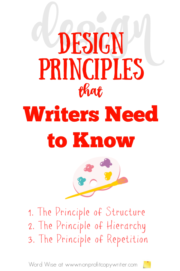
- The principle of structure. Designers call this principle “balance.” What’s the format of your content – mirrored elements on either side of a central line (symmetrical balance) or different sized elements offset on your canvas (asymmetrical balance)? Both work – and achieve different ends to reinforce your message.
Symmetrical balance achieves stability. Asymmetrical balance offers vigor. Structure gives your content a sense of order and makes it easier for readers to absorb information, whichever format you choose. Avoid cluttered designs that distract from the core message. Less can often be more. - The principle of hierarchy. When you write content, you put the main point near the top. And you understand that headlines, subheadings, and key points must stand out on a page, whether it’s print or online.
Designers use typography, color, and layout to help you navigate content. It’s the principle of visual hierarchy – arranging elements to show their importance and to help havigation. Larger fonts help headlines and subheads stand out. Strong colors emphasize a point. White space eases the eye. Choose what you want to emphasize and create your page hierarchy accordingly. - The principle of repetition. You can call it brand consistency, if you like. The principle is simple: choose a set of fonts, colors, and shapes to use throughout your design and across your website, socials, and collateral material. Then stick with them. You associate Coca-Cola with red and white – Apple with a fruit icon.
Repetition creates unity. And when you keep the same elements uniform, then you become recognizable. The opposite is also true. If you keep changing your logo and your colors, then followers will wonder if you’re a new brand and as a result, they may not trust you or follow you. Maintain consistency in design elements throughout all communications and you will strengthen brand identity. Bottom line: even if you’re not a designer, choose a couple of colors, fonts, and a logo consistently across your website, socials, and products.
Copywriting and design: what basic design skills can you learn?
Content writers and copywriters aren’t expected to be professional designers, but you can acquire basic design skills to create your own content. Plus, the ability to offer basic design makes you more attractive prospective clients. I’ve used my meager design skills to help small businesses and nonprofits with basic projects. You can too when you learn these basic skills.
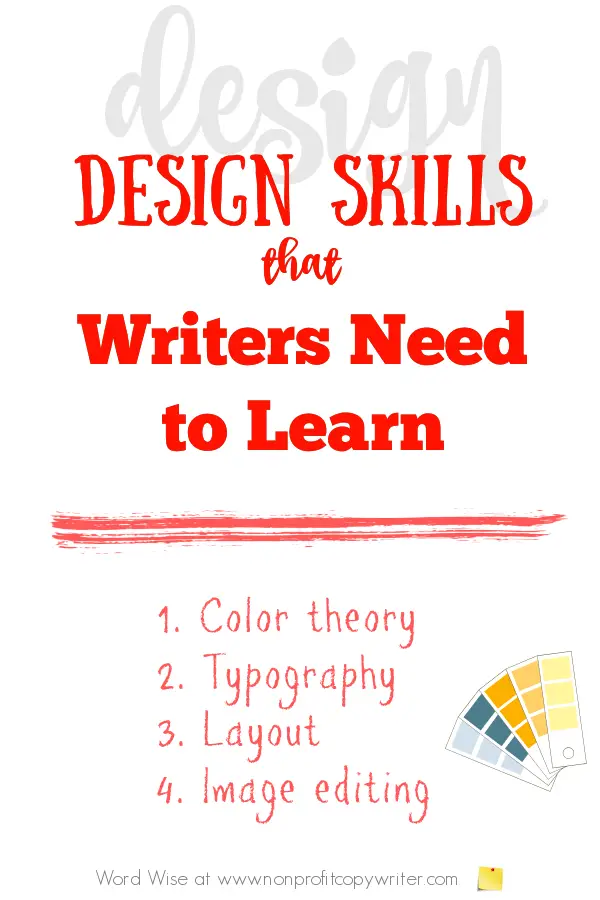
- Color theory. Colors evoke emotions. For instance, red attracts attention and is associated with strong feelings – love, anger, danger. You can use colors create harmony or contrast in visual content.
- Typography. Serif, sans-serif, decorative fonts: learn which is which. And if you’ve spent anytime online, you know how to change font size, use italics, and underline a word or phrase. Those skills improve readability and visual appeal.
- Layout. Grid systems, alignment, and whitespace create balanced compositions.
- Image editing. You may already know how to crop, resize, and enhance an image on your iPhone. You’ll get even better when you create personalized graphics for your blog or website.
Combine copywriting and design to create your visual brand
Everybody who wants to create consistent messaging needs to have visual brand elements -- logo, colors, and font – for recognition. Think Nike, with its white swoosh and the motivation to “just do it.” Ads, images, posters, webpages – Nike uses its brand in every piece of content.
Your visual brand is your combined distinctive design elements: your logo, color palette (2-3 colors, including their hexadecimal numbers), and font. I’d toss in your website template, too. An added advantage: when you know what colors and fonts to use ahead of time, you don’t need to “invent the wheel” every time you create an image for a blog post or web page.
You may already have branding elements in place. If not, do so. Should you DIY or pay a designer to create your logo and brand? I’ve done both. Both approaches have worked for me.
The point is this: your visual brand helps build consistency. You use those brand elements as building blocks for visual content pieces. Use your branding elements to put a stamp on each piece of visual content.
Combine copywriting and design in your content
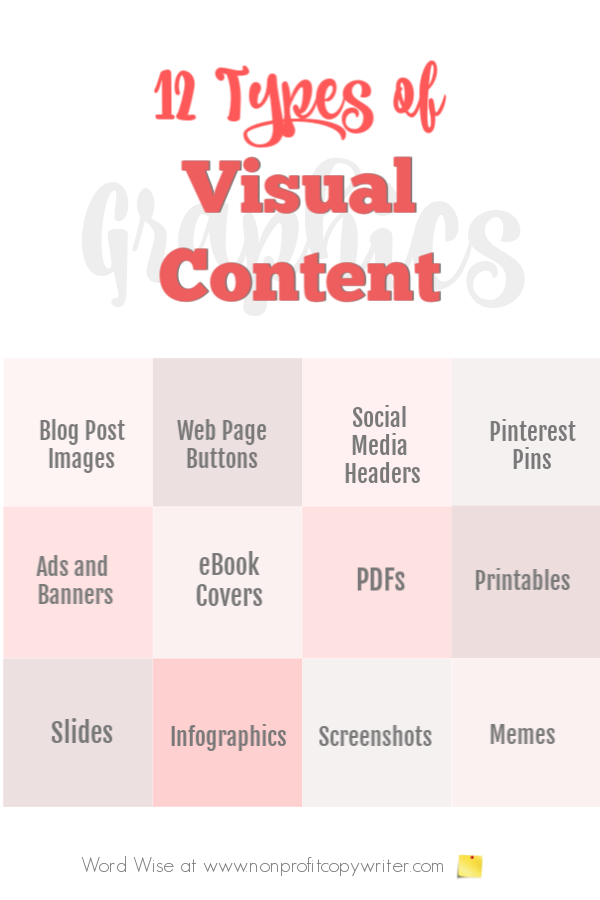
Visual content is an image that communicates information. If you have your own website, blog, and socials, you can create visual content to go hand-in-hand with your written content and reinforce it.
|
|
You can also offer basic design skills to clients who hire you to write content or copy.
- Website content. Enhance web copy with visually appealing layouts and graphics.
- Social media campaigns. Creating eye-catching posts and ads that align with the message of your content.
- Email newsletters. Design your own templates – or tweak those offered by email list managers – to reinforce other content and increase readability.
- Print collateral. Create brochures, flyers, posters, and presentations that marry compelling content with impactful design.
Graphics and copywriting tools for new and DIY designers
If you’re looking to grow your design skills without formal training and at no or low cost, check out these user-friendly tools.
- Canva: a graphic design platform that offers templates and easy-to-use tools for creating graphics, social media posts, and presentations – with a free version available.
- PicMonkey: a graphic design platform but also a photo editor, design maker, sticker maker, collage maker, and ad maker – with a free version available.
- Adobe Spark: a graphic design program that simplifies creating web pages, graphics and videos -0 with a free plan available.
- Pixlr: a free online photo editing and graphic design tool similar to Photoshop that allows you to make quick image adjustments and enhancements. Pixlr uses AI to simplify complex tasks.
- Google Fonts: a library of free, open-source fonts and icons to give you a range of typography choices.
Copywriting and design: should you offer both?
If you’re a freelance content writer or copywriter who acquires basic design skills, you can position yourself as a one-stop-shop with prospective clients.
- Display your portfolio. Showcase projects where you’ve created both content and design. Include links on your website and offer samples in print to a prospective client.
- Create a service package. Offer clients bundled services including copywriting and design. Explain how they can save costs and hassle by using one vendor: you. Make sure you clarify what you will provide and that you are able to not just deliver what you promise – but overdeliver. For instance, if your strength is in writing content, explain that can add visuals to their site for an extra fee, but they must provide you with the website template, brand fonts and colors, and logo.
- Client education. Offer a tip sheet to new and prospective clients that explains how integrating content and design can benefit them: they’ll save time, hassle, money, and have a consistent product. Teach them to make elements like font, colors, and sizing accessible to all users.
Graphics and copywriting combined add value for your clients – and your readers
When you learn some basic design principles and acquire some simple design skills, you set yourself apart. Yes, you have the ability to add value for clients.
But there’s more. You use those principles and skills in your own content … and it immediately becomes more interesting, valuable, and relevant to your own readers. No wonder your message becomes clearer to them and they follow you more closely … and their number grows.
More Content Writing Tips
Picture This: Where to Find Free Images for Your Blog or Website ...
3 Writing Tips to Help You DIY Graphics: A Tutorial ...
5 Non-Writing Skills Every Writer Needs ...
The Best Place to Find Images for Your Newsletter ...
7 Content Ideas to Build Your Audience ...
What is Free Content and Why Should I Offer It?
Repurposing Content: get 21 pieces of content from one ...
How to build a writing sample portfolio ...
More Tips for Writing Content on our Pinterest board ...
Return from Graphics and Copywriting: A Tutorial
to Nonprofit Copywriter home
As an Amazon Associate I earn from qualifying purchases.
Share This Page

Named to 2022 Writer's Digest list
BEST GENRE/NICHE WRITING WEBSITE


Stop Wasting Time!

Grab your exclusive FREE guide, "5 Simple Writing Tips You Can Put to Use in 10 Minutes or Less"


